PLUTO started as an EP but became something bigger once I realized how much of myself I was putting into it.
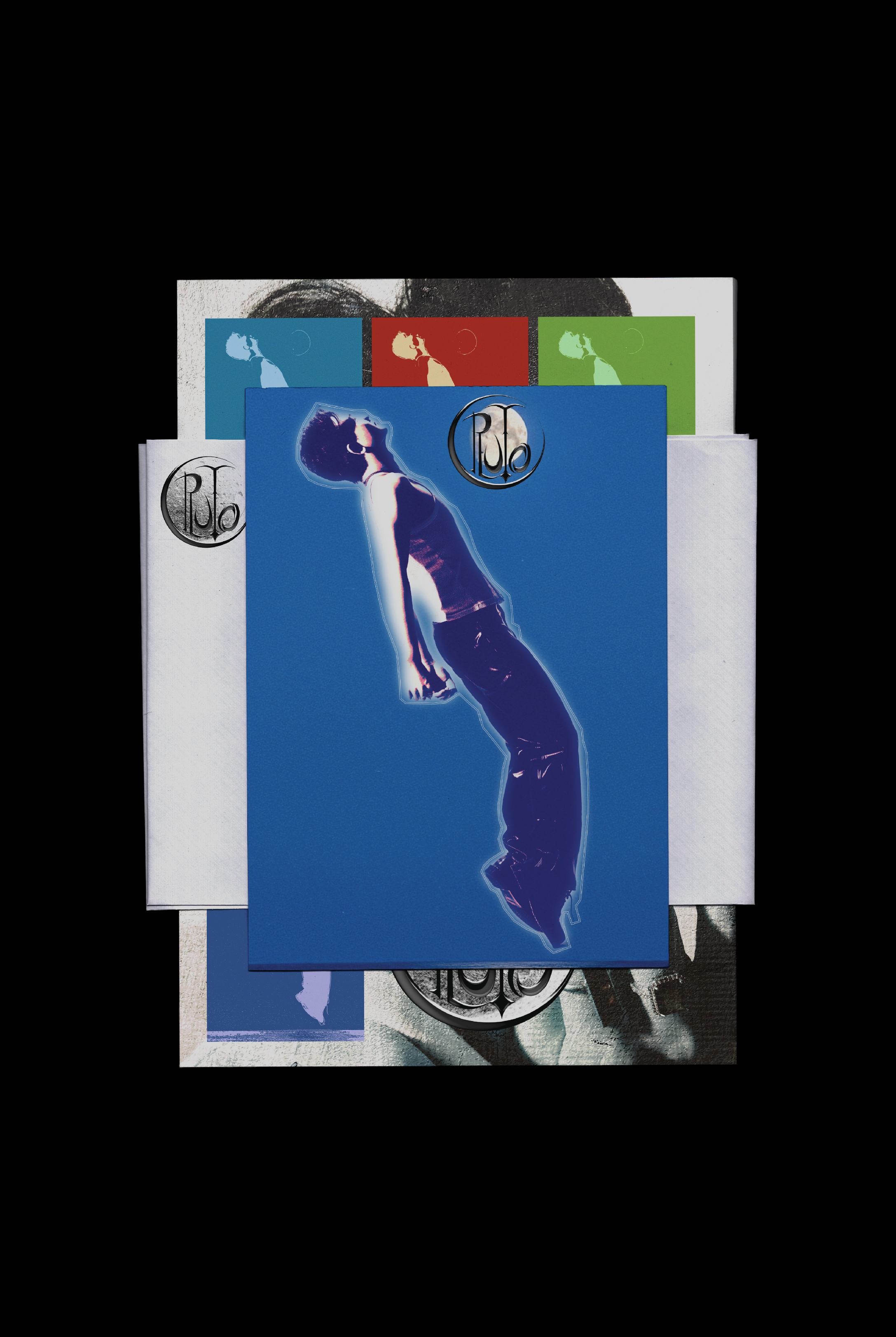
The visual side of this project came naturally because I wasn’t just designing for a brand—I was designing for a story I knew deeply. Every part of the identity, from the colors to the layout to the fake ticket receipt, came from memories, moods, and phases I’ve been through. I wanted the visuals to feel like they belonged to the same world as the music—nostalgic, emotional, sometimes a little messy, but always intentional.
This project is about the transition from being a kid to becoming something else. I didn’t want to make it too clean or too polished because that’s not what that period feels like. Instead, I leaned into textures, off-kilter compositions, and quiet moments. It’s personal. It’s vulnerable. And putting it all together—designing it, producing it, writing it—felt like giving younger me a space to be seen.
PLUTO is a reflection of that version of me. Not perfect, not finished, but full of heart.
Visual Identity


Brand Details

PLUTO is one of the most personal projects I’ve ever made.
I didn’t just create the music—I handled every part of it: production, creative direction, visual design, album rollout, and merch. This wasn’t about building a brand for the sake of it. I wanted everything to feel intentional and emotionally honest, with visual choices that tie directly back to the stories in each track.
The EP explores the weird, often quiet transition from youth to young adulthood. I brought that same energy into the branding—nostalgic but future-facing, soft around the edges but still graphic and bold. I hid references to specific songs throughout the visual system, whether in the colors, textures, or phrasing. The design is full of signs and symbols that mean something to me, even if they’re subtle to others.
Everything in PLUTO is connected. The music, the merch, the visuals—they’re all part of the same world I built to make sense of growing up.